Meet Horizon UI · 2/16: Dashboards That Adapt — MQE, Smart Widgets, and Numbers Humans Can Read
This is the second post in the Apache SkyWalking Horizon UI series. The first one introduced the console and its layered navigation; this one is about the surface you spend most of your day on — the dashboards.
Every dashboard in Horizon is the same machine: a grid of widgets, each one an MQE expression the BFF resolves against OAP. What makes the surface worth a post of its own is what that machine does around the numbers — it hides the widgets that don’t apply to the entity you’re looking at (and skips their queries entirely), it renders coded values and raw byte counts as things a human can read, it ties every chart on the page to one cursor, and it drops you from a slow-SQL row straight into the trace that produced it. Let’s walk through it.
Every widget is one MQE expression
A layer dashboard is a dense 12-column grid (120px rows, gaps backfilled so a wall of tiles has no holes, collapsing to one column under ~1100px). Each tile is one of five widget types, and the type follows the shape of its MQE expression:
card— the expression collapses to a single scalar (latest(...),avg(...),service_sla/100). One big number.line— a time series; one line per expression, optional dual y-axis for mixed units (throughput on the left, latency on the right).top— a ranked list fromtop_n(endpoint_cpm, 20, des), with a small tab switcher to flip the ranking between Traffic / Slow / Successful Rate.record— record-shaped output like slow database statements or slow cache commands: rows of text + value.table— a labeledlatest(...)metric, one row per label combination (pod phase per service, node condition, replicas per deployment).
You don’t pick the chart; you write the MQE and the right widget renders it. And it’s the same grid system at every altitude — the dashboards.<scope> map on a layer template carries a different widget set for the service, instance, and endpoint pages, so drilling down swaps the whole dashboard to the right scope. (All of these run on the BFF tier introduced in part 1 — the browser never talks to OAP directly.)
A dashboard that adapts to the entity in front of you
Here’s the feature that changes how a dashboard feels. A widget can carry a visibleWhen gate, and when the gate doesn’t hold, the widget doesn’t render — and, crucially, its query never runs.
There are two kinds of gate:
- MQE metric — show the widget only when an expression has value (
op: exists), or when its value crosses a threshold (gt/lt). Point a widget at its own metric and it self-gates: the JVM widgets carry"visibleWhen": { "kind": "mqe", "expression": "instance_jvm_cpu", "op": "exists" }, so they appear on a Java instance and vanish on a Go one. - Entity attribute — on the Instance scope, gate on the selected instance’s attributes (
language eq JAVA, or an attribute simply being present).
Because the gate is evaluated server-side, a non-JVM instance doesn’t just hide the JVM tiles — the BFF never sends their queries to OAP at all. Open the same Instance dashboard for a JVM service and a non-JVM one and you’re looking at one template adapting itself, not two hand-built pages:
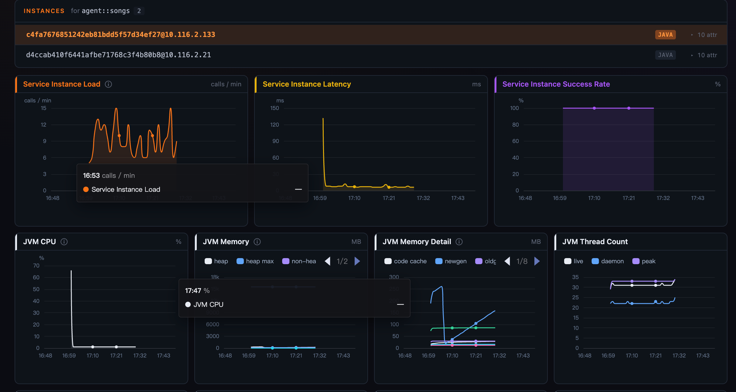 Figure 1: On a JVM instance the JVM widgets render — their
 visibleWhen gate holds.
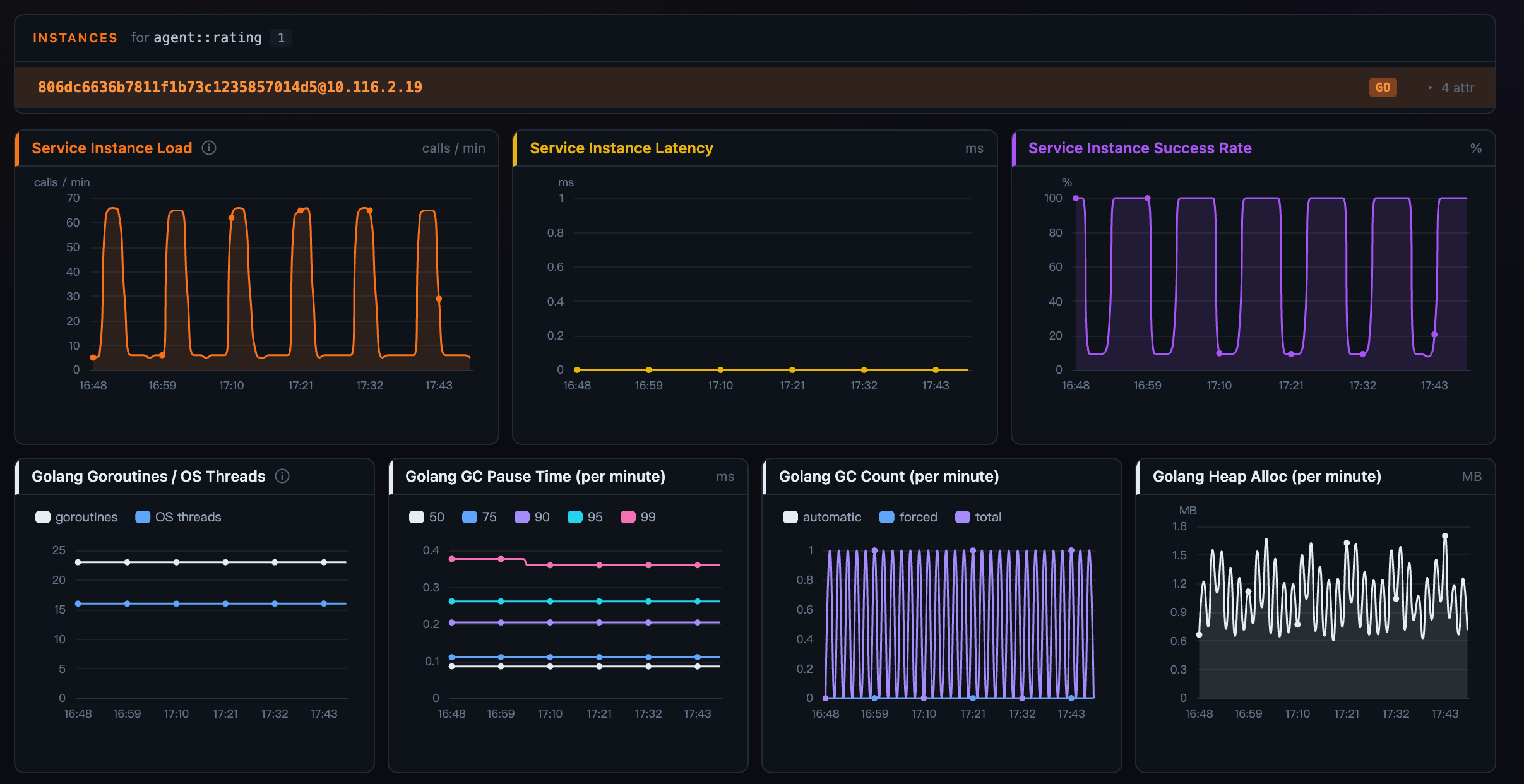 Figure 2: The same dashboard on a Go instance — the JVM widgets aren’t there, and their queries never ran. One template, adapting to the entity.
Numbers humans can read
Raw metrics are not always readable metrics. Horizon’s widgets format three cases that used to make operators do math in their heads:
enum— a value→label map turns a coded gauge into words: a1/0success metric rendersOK/Failedinstead of the bare number. The labels are translatable per locale.duration— a metric in seconds renders as a human time-ago:5m 20s ago, compact to5m/2hon an axis.- SI suffixes — large magnitudes on chart axes and tooltips read as
45.1k,1.34M,2.5Grather than4.51e4, with the axis tick and its hovered value sharing one notation.
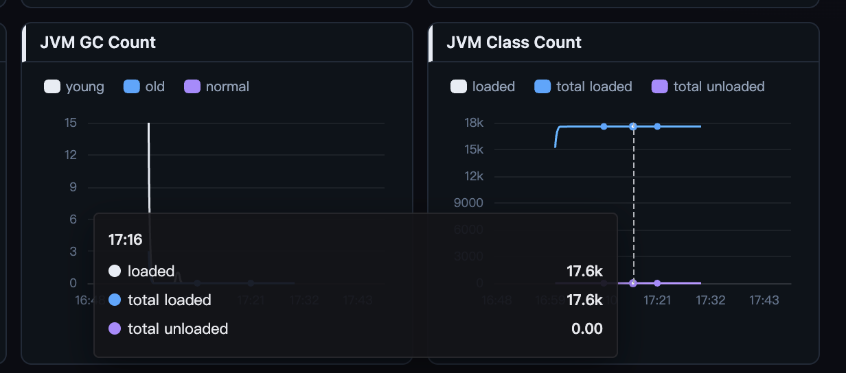 Figure 3: Dense byte and count series get compact SI suffixes, axis and tooltip in step.
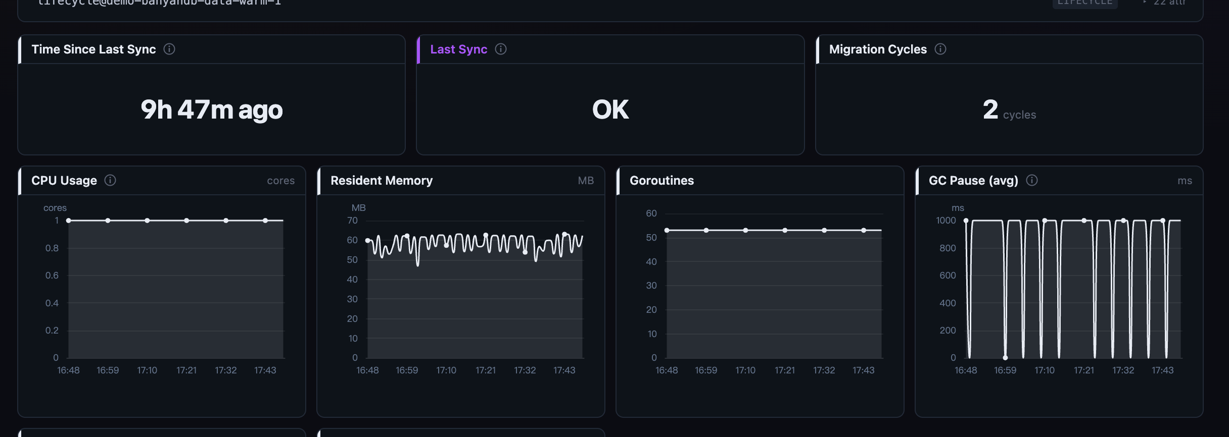 Figure 4: The
 enum and duration formats in action on BanyanDB’s lifecycle cards — OK instead of 1, “5m 20s ago” instead of a seconds count.
Read the whole grid as one timeline
Every line chart on a page shares one hover cursor. Point at minute 32 on the throughput chart and minute 32 lights up on the latency chart, the error-rate chart, and every sparkline tile. The contract is enforced at the chart-wrapper level — no widget can opt out — so the page reads as a single coordinated view of one moment, not a dozen independent charts. The multi-series tooltip is a fixed, aligned table that shows each series’ title (never the raw MQE), with values in one right-aligned column.
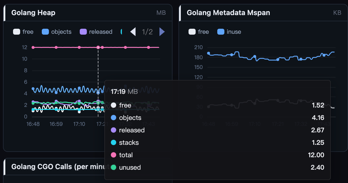 Figure 5: One cursor moves across every line chart on the page, so you read the same instant everywhere at once.
From a slow row to its trace, in one click
record widgets — Slow Statements, Slow Commands, Slow Database Statements — are lists of sampled records, and each row that carries a trace id gets a jump-to-trace icon at its head that opens the originating trace’s waterfall. It resolves the trace by id, not by layer, which matters: the Slow Statements on a Virtual Database / Cache / MQ service belong to the caller on another layer, and a virtual-target layer has no traces tab of its own — yet the jump still lands. The statement text itself is click-to-copy.
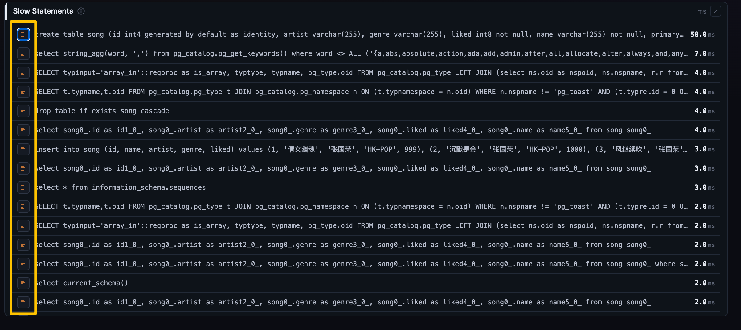 Figure 6: From a slow statement to the trace that ran it — resolved by trace id, so it works even on a virtual layer with no traces tab of its own.
Pin and compare entities
Sometimes one entity isn’t enough. Horizon lets you lock several services, instances, or endpoints — even ones from different services — and compare them in place. Pin entities from the picker or the instance/endpoint list; the one you’re viewing is always part of the cohort (tagged CURRENT) and still drives the header, and each pin adds its own hue. Every widget then compares inline — line widgets overlay one series per entity, cards show a row each, top and record widgets get per-entity tabs, tables gain an Entity column. A persistent comparison bar holds the cohort no matter how the underlying list paginates or which entity you’re currently viewing, and each entity loads as its own request, so one slow one never blanks the others.
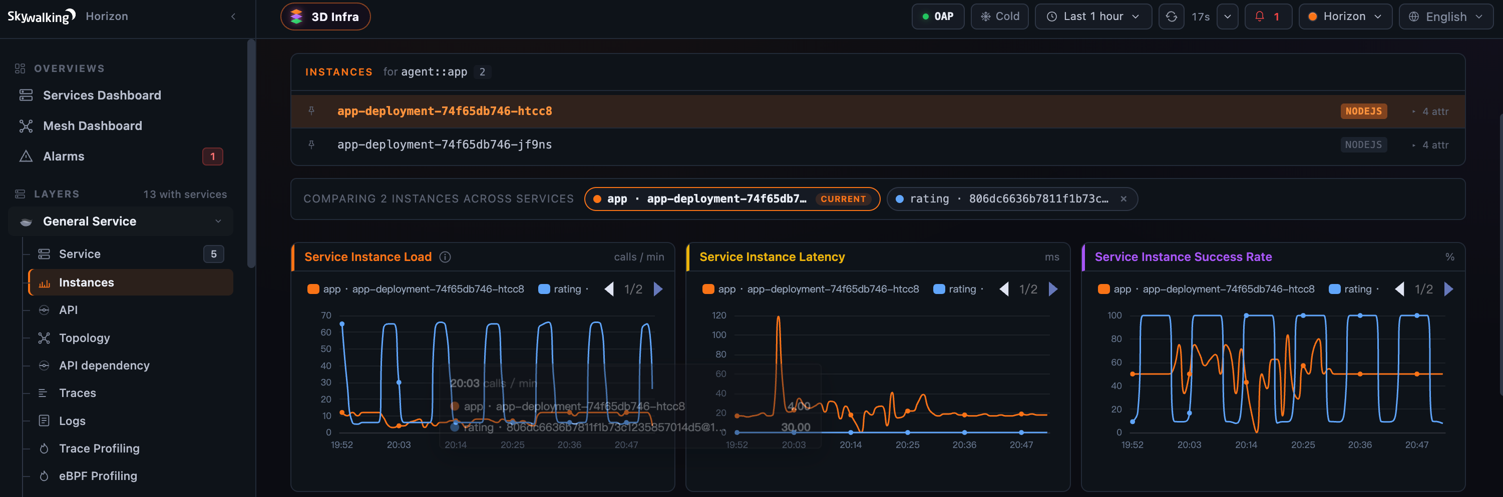 Figure 7: Lock entities — even across services — and every line widget overlays them hue-by-hue; the comparison bar holds the cohort while the CURRENT entity still drives the header.
The time picker moves the whole dashboard
The topbar time range drives everything on the page — the header KPI strip, the widget body, and (on BanyanDB’s tiered hot/warm/cold storage) the Cold pill flow end-to-end. Earlier the landing and topology routes were pinned to the last 60 minutes, so picking “12 days ago” quietly kept showing recent numbers; now the picker is honored everywhere, and when an upstream control changes, each dependent tile visibly resets and shows a “Reading data…” hint rather than leaving a stale value under a spinner.
Where to go next
It’s worth stressing that this is one system. The same five widgets, the same MQE, the same gating render every layer’s dashboard — the JVM panels above, BanyanDB’s lifecycle cards, the percentile latency on a mesh service, and purpose-built panels for things like an Envoy AI Gateway (token throughput, time-to-first-token) or a GenAI virtual layer (per-model estimated cost). What changes from layer to layer is the MQE, not the machinery.
Everything above is the reading experience. Each widget’s MQE, its visibleWhen gate, its format, and the per-scope grids are all editable from the Layer dashboards admin — but that authoring story (draft → preview → publish, with the inline-and-expand MQE editor) is its own post later in the series. For the field-level reference, see the docs on dashboard widgets and charts.
Next up: topology and service dependency — the same data Horizon charts here, drawn as a map you can walk.